

PERSONA // REDESIGNING THE CASES CHECKLIST EXPERIENCE
TIMELINE
June - August 2026
ROLE
Product Designer
TEAM
1 Product Manager,
1 Engineering Manager,
1 Design Advisor,
1 Product Designer (me)
TOOLS
Figma,
Cursor,
Claude Code
PRODUCT CONTEXT
Persona is a platform that handles identity verification. Persona’s Cases platform is a surface that handles manual verification review for verifications that have been flagged as potentially fraudulent.
Cases has two users: BUILDERS and REVIEWERS. The builders create CASE TEMPLATES, which are built with configurable MODULES. A case will be an instance of the case template, and this is what the reviewers use to perform the case review.
The main goal of a case is for the reviewer to assign a status to a specific verification. Once a case is assigned a terminal status, the case is closed. Some examples of statuses can be “Approved”, “In Review”, and “Declined”.
One of the modules is the Checklist. Here, builders define tasks that a reviewer must complete during a review. Checklist items can also gate specific status assignments. For example, “Verify validity of all document uploads” could be a checklist item that must be completed before a reviewer can mark a case as “Approved”. These are STATUS CHANGE RULES.
Originally, these rules would be applied to specific status. For example, a checklist item could be required whenever a case was moved into “In Review”, regardless of the source status.
Alongside this project, there was a project called the CASE STATE MACHINE. This project allowed builders to define STATUS TRANSITION RULES. A checklist item can specifically gate the transition of moving a case from “Declined” to “In Review”, and not the transition of “Approved” to “In Review”.

PROJECT CONTEXT
The Cases surface in general was also in the process of getting a UI refresh. Our Persona Design System (PDS) had a lot of new design updates. There was also an initiative to transform all our configuration panels to be more compact (“Compact Panel Patterns”). Other surfaces of Persona had already integrated these updates, but Cases hadn’t been fully addressed yet. In addition, with the new Case State Machine, we needed to update the checklist to reflect and support all the new functionality.
ASIDE : COMPACT PANEL PATTERNS
In Persona, there’s a surface called the Flow Editor. This is where the Compact Panel Patterns originated from.
With this new pattern, we’re essentially just trying to condense and simplify our configuration experience as the product becomes more technically complex.
Prior to this Checklist project, there were only two other modules within Cases that had adopted the new pattern (Data Table and Data Display).
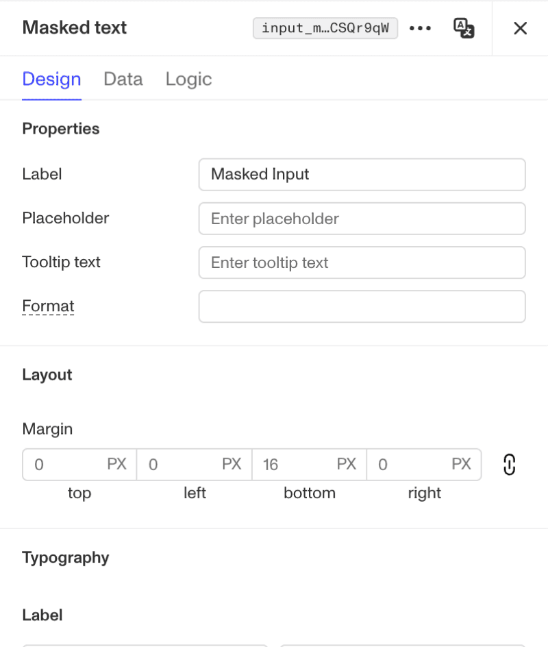
Compact Panel Pattern in Flow Editor

Compact Panel Pattern in Cases
GOALS
Through this project, we want to rethink and improve the Cases Checklist experience. The underlying product was becoming more complex due to the Case State Machine and also new product goals for the checklist alone. At the same time though, the entire platform was aiming to become simpler with the Compact Panel Patterns initiative. The main goal here is to support the increased Checklist complexity without increasing complexity within the user experience itself.
OLD VS. NEW
The Cases Checklist can be broken down into three main parts: The Cases Right Panel, the Checklist Editor Modal, and the Checklist Module
OLD
NEW
Right Panel
Editor Modal
Checklist Module

Problems to solve:
The search bar and checklist item display are not using components in our PDS.
The search bar can be mistaken as a Checklist configuration because it is formatted the same as the “Title” configuration
The spacing between the search bar and the item list is misleading. The search bar does not seem evidently related to the item list.
When populated, the item list becomes very long and distracting. The right panel becomes harder to scan.
Checklist item deletion is not supported. Items can only be disabled and enabled.
FINAL DESIGNS

COMPLICATIONS
REMOVING THE SEARCH BAR
One thing you’ll notice about the new designs is that the search bar was actually removed entirely.
Originally, since this project was framed as a “redesign” project, it made sense to me to first try to redesign the search bar as well. However, this was a good reminder for me to question everything.
When I was first introduced to this surface, I immediately thought that the search bar design was unintuitive. This prompted me to think about a few questions:
Are builders aware of this search functionality?
How many people actually use the search bar? Is it useful?
What was the reason for introducing the search bar in the first place?
Upon talking to some PMs, EMs, and sales engineers that actively use Cases, it turns out that the search bar was used very infrequently. It was originally integrated very early on in the product lifetime unintentionally and without design team input. I also wanted to take it a step further and investigate how many checklist items typically exist on one checklist. After running a SQL query on real customer data, we discovered that there’s only an average of 6.85 checklist items per case. Keeping this in mind, and also recalling that checklists items at this point could not be deleted (only disabled), we can very clearly see that the search bar was not contributing the most to this experience. With this information, it made most sense to remove it.
Evidently, this removes the support of being able to search through a populated list of checklist items. This introduces a regression with the designs and has the potential to create a lot of consequences and complaints. Knowing our findings, it’s unlikely that there will be a lot of important complaints with this regression, but to prepare for those scenarios, I also designed an alternative solution that reintroduces the search bar, but in a more intuitive way.
This isn’t currently supported in our PDS, so I had played around with a couple variants.


Ultimately, this was the final proposed solution — a toggleable search bar integrated into the list of checklist items:


BUILDING ALONGSIDE CASE STATE MACHINE
The Case State Machine project brought a new feature that the checklist would need to support: status transition rules. We had agreed very early on that configuring the rules themselves would now be delegated from the checklist configuration to the Case State Machine surface, but this leaves us with finding a solution to display the status transitions on the checklist.
There were a few things that I had to keep in mind while working on this:
One of the goals with the redesign is to prevent excess clutter. With the current state of the checklist, it's very common for reviewers to see checklist items that aren't relevant to them at all (eg. if they don't have all the permissions, or if their current case status isn't even relevant to the checklist item in question). Displaying status transitions instead of just statuses can very easily lead to more clutter.
How relevant is this new feature? Is it necessary for the status transitions to be displayed in a very accessible manner? Not only that, but it's important to understand how important these statuses are even in today's circumstances. This ultimately ties back to the concern of excess clutter within the checklist.
While working on this project, there were plans to do UXR on the Case State Machine after the end of my internship. This meant that I wouldn't be able to get all my questions answered if I waited for the findings of this UXR session. This prompted me to initiate some informal UXR and ask various sales engineers that frequently work with Cases Checklists. Because this wasn't a "formal" UXR session and was solely internal, it was a lot easier to get my questions sufficiently answered such that I would be able to unblock myself and make productive progress. It's true that external formal UXR is very valuable, but knowing my time constraints, I wanted to make sure I did everything in my control to move the project forward.
Before conducting research, I came up with a few rough designs, since tangible work helps make a conversation a lot more productive.

Option 1
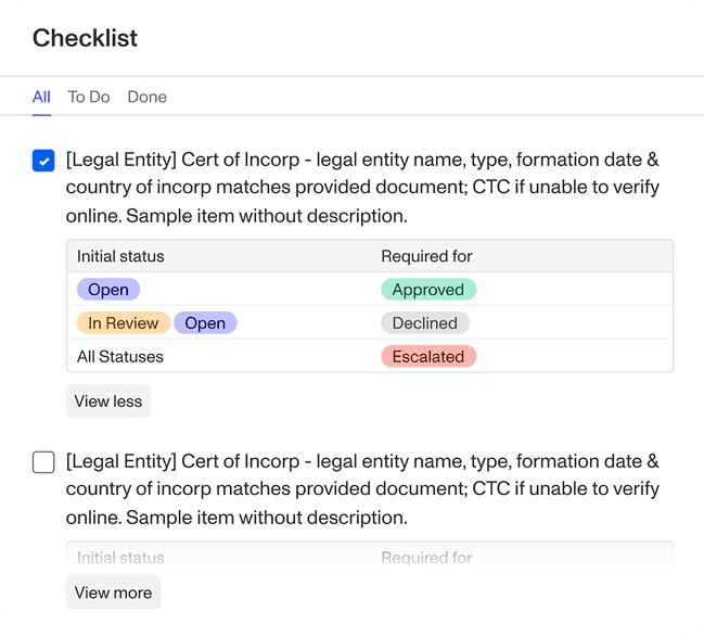
Option 2

Option 3
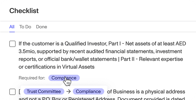
Option 4
After a few talks and review sessions with the sales engineers, the findings were as follows:
There was a lot of emphasis and reinforcement on the idea that they want the checklist to be as simple as possible; ideally only ever showing checklist items that are relevant to them.
After coordinating with the engineering team, the implementation of this redesign project will include only presenting checklist items that are relevant to the reviewer's permissions and to the current case's status.
They believed that showing full transitions is unnecessary. Upon reviewing a case, through the data gathered, the reviewer should already have a status in mind that they want to assign a case to. For instance, if a reviewer is reviewing a set of verification documents and they seem fraudulent, they would already think to assign the case to "Declined". Knowing that, the most logical next step is to look at the checklist items needed to be completed to officially assign the case to "Declined". Therefore, just seeing the end status is sufficient.
Although clutter is a concern, it was confirmed that reviewers want to easily see the end statuses without any friction.
With these findings, it made sense to actually stick to the existing checklist module design considering the engineering team was planning on improving the backend experience. However, in the case that the engineering effort would require more time, Option 4 was the final proposed solution. This solution doesn't add any extra clutter on top of what already exists today, we explicitly show the end status without any extra friction, but the option to view the transition on hover will always be available if needed.
TAKEAWAYS
This was my first big design project after officially pivoting into design from software engineering. Consequently, my takeaways mainly revolve around "product-minded thinking". I learned a lot from just this project alone, and I would summarize my takeaways as follows:
Question everything. This is something I was already used to when given a new project; I'm familiar with questioning proposals to ensure that our final solution is something that is worth the initiative. This project showed me the importance of questioning existing features as well. Just because something is already in production doesn't mean that it's perfect.
Seek input, constantly. Formal UXR and asking for feedback during design crits are common and expected. This project reminded me that informal UXR is very accessible and extremely helpful too. At Persona, we have a lot of sales engineers that work directly with the product. When designs are at the beginning stages and when a lot of options are being considered, making a reasonable conclusion becomes a lot faster when you can get input from internal users without needing to go through the wait times of formal UXR.
Have a "strong opinion, loosely held". Being opinionated is always beneficial when working in product design. When you have a strong opinion along with context and reasoning, it becomes very easy to drive a productive conversation. But, as always, it's important to stay open-minded. In a space where there's no formal PRD or direction, this mentality becomes a lot more helpful. It's true that this isn't necessarily a 'revolutionary' way of thinking, but this exact phrase was introduced to me through this project, and I know this will help me a lot with my designs going forward.